Give Feedback While Logging In
It’s important that we give the user some feedback while we are logging them in. So they get the sense that the app is still working, as opposed to being unresponsive.
Use an isLoading Flag
 To do this we are going to add an
 isLoading flag to the state of our src/containers/Login.js. Add the following to the top of our Login function component.
const [isLoading, setIsLoading] = useState(false);
And we’ll update it while we are logging in. So our handleSubmit function now looks like so:
async function handleSubmit(event) {
  event.preventDefault();

  setIsLoading(true);

  try {
    await Auth.signIn(email, password);
    userHasAuthenticated(true);
    history.push("/");
  } catch (e) {
    alert(e.message);
    setIsLoading(false);
  }
}
Create a Loader Button
Now to reflect the state change in our button we are going to render it differently based on the isLoading flag. But we are going to need this piece of code in a lot of different places. So it makes sense that we create a reusable component out of it.
Create a src/components/ directory by running this command in your working directory.
$ mkdir src/components/
Here we’ll be storing all our React components that are not dealing directly with our API or responding to routes.
Create a new file and add the following in src/components/LoaderButton.js.
import React from "react";
import Button from "react-bootstrap/Button";
import { BsArrowRepeat } from "react-icons/bs";
import "./LoaderButton.css";

export default function LoaderButton({
  isLoading,
  className = "",
  disabled = false,
  ...props
}) {
  return (
    <Button
      disabled={disabled || isLoading}
      className={`LoaderButton ${className}`}
      {...props}
    >
      {isLoading && <BsArrowRepeat className="spinning" />}
      {props.children}
    </Button>
  );
}
This is a really simple component that takes an isLoading prop and disabled prop. The latter is a result of what we have currently in our Login button. And we ensure that the button is disabled when isLoading is true. This makes it so that the user can’t click it while we are in the process of logging them in.
The className prop that we have is to ensure that a CSS class that’s set for this component, doesn’t override the LoaderButton CSS class that we are using internally.
When the isLoading flag is on, we show an icon. The icon we include is from the Bootstrap icon set of React Icons.
And let’s add a couple of styles to animate our loading icon.
Add the following to src/components/LoaderButton.css.
.LoaderButton .spinning {
  margin-right: 7px;
  top: 2px;
  animation: spin 1s infinite linear;
}

@keyframes spin {
  from {
    transform: scale(1) rotate(0deg);
  }
  to {
    transform: scale(1) rotate(360deg);
  }
}
This spins the icon infinitely with each spin taking a second. And by adding these styles as a part of the LoaderButton we keep them self contained within the component.
Render Using the isLoading Flag
Now we can use our new component in our Login container.
In src/containers/Login.js find the <Button> component in the return statement.
<Button block size="lg" type="submit" disabled={!validateForm()}>
  Login
</Button>
And replace it with this.
<LoaderButton
  block
  size="lg"
  type="submit"
  isLoading={isLoading}
  disabled={!validateForm()}
>
  Login
</LoaderButton>
Also, let’s replace Button import in the header. Remove this.
import Button from "react-bootstrap/Button";
And add the following.
import LoaderButton from "../components/LoaderButton";
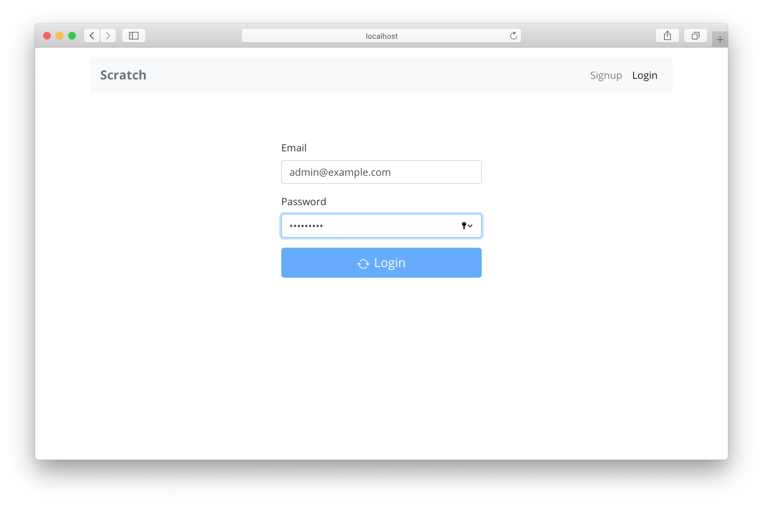
And now when we switch over to the browser and try logging in, you should see the intermediate state before the login completes.
Handling Errors
You might have noticed in our Login and App components that we simply alert when there is an error. We are going to keep our error handling simple. But it’ll help us further down the line if we handle all of our errors in one place.
To do that, add the following to src/libs/errorLib.js.
export function onError(error) {
  let message = error.toString();

  // Auth errors
  if (!(error instanceof Error) && error.message) {
    message = error.message;
  }

  alert(message);
}
The Auth package throws errors in a different format, so all this code does is alert the error message we need. And in all other cases simply alert the error object itself.
Let’s use this in our Login container.
Import the new error lib in the header of src/containers/Login.js.
import { onError } from "../libs/errorLib";
And replace alert(e.message); in the handleSubmit function with:
onError(e);
We’ll do something similar in the App component.
Import the error lib in the header of src/App.js.
import { onError } from "./libs/errorLib";
And replace alert(e); in the onLoad function with:
onError(e);
We’ll improve our error handling a little later on in the guide.
Also, if you would like to add Forgot Password functionality for your users, you can refer to our Extra Credit series of chapters on user management.
For now, we are ready to move on to the sign up process for our app.
For help and discussion
Comments on this chapter